Foreign Population via Baby Names
1910
Massachusetts
Introduction
Cultural and societal changes are an undeniable influence on our lives, yet it is so difficult to accurately quantify and track these developments. The principle issue is identifying metrics that appropriately encapsulate such a complex and intractable set of phenomena. Using U.S. baby name and Census country-of-origin data, we seek to find an appropriate proxy for nationwide diversification. Due to the strong ties between one’s name and country of origin, ethnicity, and religion, we believe distribution of baby names over time to be powerful predictors of demographic trends. After exploration and analysis of the given data as well as existing historical US demographics data, we ultimately decided to build a model to predict the percentage of foreign-born residents using name distributions as predictors. Using this model, we aim to interpolate the corresponding intercensal data regarding percentage of foreign-born residents in each state population in every year from 1910 to 2014.
Data Exploration
The raw dataset we were given has a row for every name that has occurred in a given state and given year, for the 50 states and Washington, D.C., and for all years from 1910 to 2014. The column values are corresponding state, year, gender of those who were given the name, and the count of people given that name. At first blush, the level of personal detail on each of these babies is very low: in the best case we only know the birth year, state, and gender of an individual. As a result, any analysis reliant on race or ethnicity will need to be indirectly extracted from this data.
| Id | Name | Year | Gender | State | Count |
|---|---|---|---|---|---|
| 1 | Mary | 1910 | F | AK | 14 |
| 2 | Annie | 1910 | F | AK | 12 |
| ... | ... | ... | ... | ... | ... |
| 5647424 | Victor | 2014 | M | WY | 5 |
Some useful summary statistics can nonetheless be gleaned from these preliminary data. The most popular boys’ and girls’ names of all time are Mary and James: 4,155,282 and 5,105,919 babies cumulatively since 1880, respectively. The most popular gender-ambiguous names change much more frequently, with the top spot going to Leslie in 1945 and Charlie in 2013. We defined a name as gender-ambiguous if its sex ratio was within 40:60 (i.e. no more than 10% away from 50-50 gender distribution). The difference in style between the most popular gender-ambiguous of 1945 and 2013 are emblematic of the increased preference towards individuality and “unique-sounding” names: the runners-up in 1945 were the traditionally-sounding Jackie, Jessie, Frankie, and Gerry. By 2013 these are replaced with Skyler, Dakota, Phoenix, and Justice. The name undergoing the greatest trend effect (i.e. the one with the largest contemporary increase since 1980) is Harper.
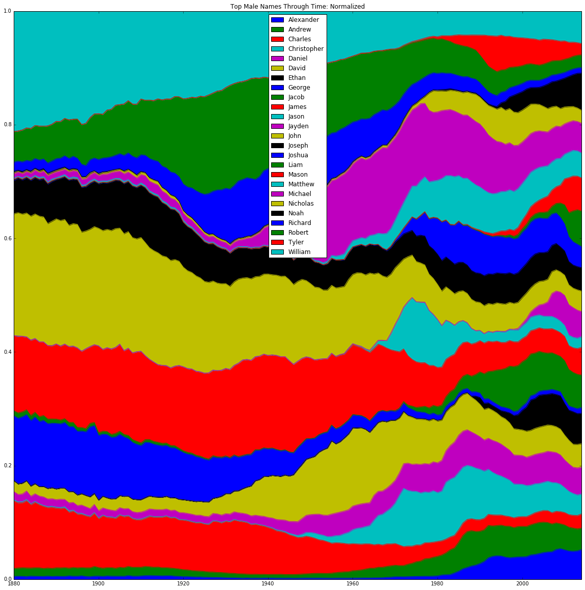
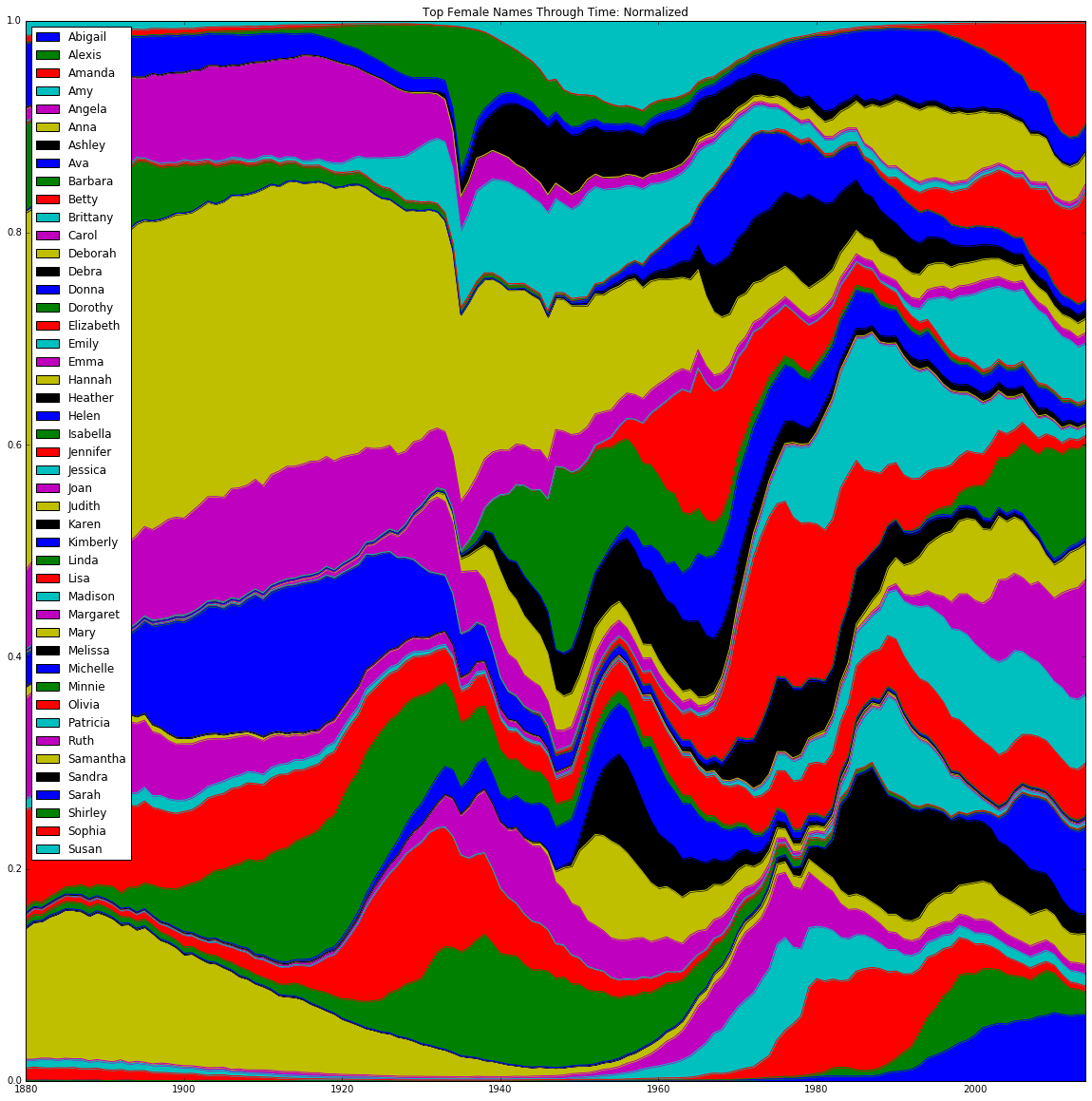
To get some initial idea of the flow of name trends, we created two sets of stacked-area graphs. The graphs plotted the total number of occurrences of each name in each year normalized to that year’s total births, with number of occurrences on the y-axis and year on the x-axis. This normalization was critical in order to compare the relative share of babies to which a given name corresponds, rather than the absolute number (which is subject to distortion by population growth). The sets were divided by gender and the criterion for including a name on the graph. The first set was only concerned with names that have been the most popular in a given year - for males, this was only 7 names, as there have only been 7 unique male names to be the most popular in a given year; for females this was 10 unique names. The second set of graphs instead took the top 5 names in each year, which turned out to be 25 unique names for males and 46 unique names for females.
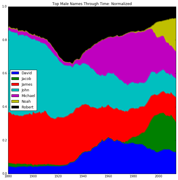
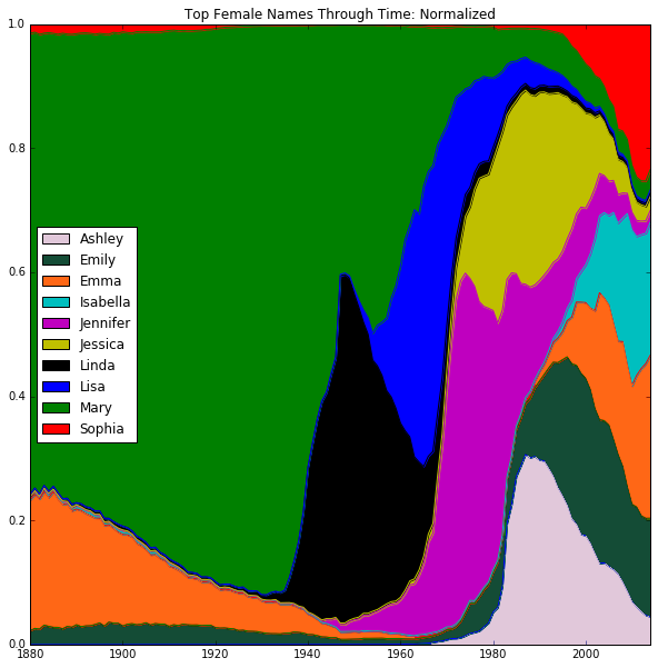
The "singularly" most popular graph (as opposed to the larger, "top 5" graph) does an excellent job of capturing the salient facts about the dataset without overcomplicating its presentation of these points. The most evident point is the greater amount of inherent individuality in girls' names than boys. The fact that 10, rather than 7 names make up the most popular for girls is one indicator. Another notable point is the high degree of volatility with which these popularities change for girls; in other words, girls' names are much more subject to fads and trends. Additionally, with the exception of Noah and Jacob, the most popular male names reach back to the beginning of the time series, and remained close to their starting relative proportions for decades. Girls' names, on the other hand, have a much more varied history, with some names (like Emma) even going out of fashion before experiencing a contemporary resurgence. There is a clear preponderance of the name Mary during the earliest section of the time series (from 1880–1930). Successive waves of name fads (Linda, Lisa, Jennifer, Jessica, Ashley) deal blow after blow to Mary, until she is nothing but a husk of a name by the 1980s. Many of Mary's opponents, like Linda, have been effectively "fossilized," with Linda's boom and bust period occurring between 1930 and 1970 (for Ashley, Jennifer, and Jessica, their periods of popularity have just ended). Up-and-comers like Isabella and Sophia seem likely to dislodge the remaining footholds of the out-of-fashion names.
The graph based on the top 5 most popular names nevertheless is useful for providing a more macroscopic view on these trends. These graphs are a strong reflection of the prior "top 1" trends: the men exhibit the dominant stability of a few names over time, while the women have a much more colorful and dynamically-changing bank of names to choose from. As a whole, these top 5 graphs are primarily helpful in confirming the two primary observations from above: (1) that the distribution of names becomes increasingly heterogeneous over time, reflecting increased cultural and racial diversity; and (2) that women's names are generally more varied and subject to stronger swings in popularity.
The graphs give us an idea of the speed with which name popularity can both increase and decrease, shown by the fluctuations in height of each name’s region over time. Furthermore, these graphs showed continuity in popularity from year to year, indicating that name popularities are driven by factors that are both time sensitive but not entirely volatile. This played a role in our decision to use name distributions to predict demographic trends.
Modeling
We started with a simple DataFrame that contained name counts for states in the US for every year since 1910. We converted this DataFrame to the predictors DataFrame. In the new DataFrame every column contains the count of every name in the original DataFrame for every decade in a given year.
| State | Year | Mary_F | Sophia_F | John_M | Robert_M | ... | Pablo_M |
|---|---|---|---|---|---|---|---|
| AK | 1910 | 128 | 96 | 85 | 66 | ... | 8 |
| AK | 1911 | 160 | 130 | 42 | 78 | ... | 20 |
| ... | ... | ... | ... | ... | ... | ... | |
| WY | 2013 | 12 | 34 | 18 | 160 | ... | 83 |
| WY | 2014 | 15 | 28 | 15 | 152 | ... | 77 |
Because of the high dimensionality of the data we considered using both PCA and Lasso for dimension reduction.
PCA
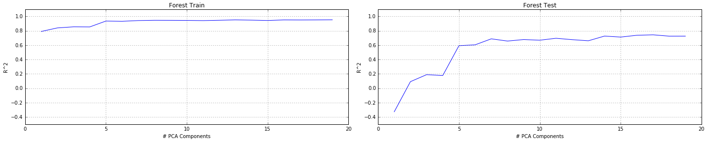
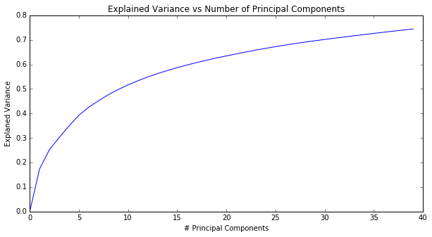
Due to the high dimensionality of the data, we performed PCA, cross-validating number of components with model score as well as explained variance. We eventually concluded that 17 was the optimal number of components for the transformation. We then trained different preliminary regression models to predict percentage of foreign-born residents in each state in each year, using only counts of each name in each state as predictors. We eventually selecting Random Forests for its high score on multiple train-test splits. We cross-validated the number of trees in the forest with the model score, determining that 50 was the optimal number of estimators.
We first had to determine to how many PCA components we need to reduce our predictors. To achieve this goal we plotted a graph of explained variance as a function of number of PCA components.
In addition, we tested different regression models and graphed each model's performance as a function of PCA components.
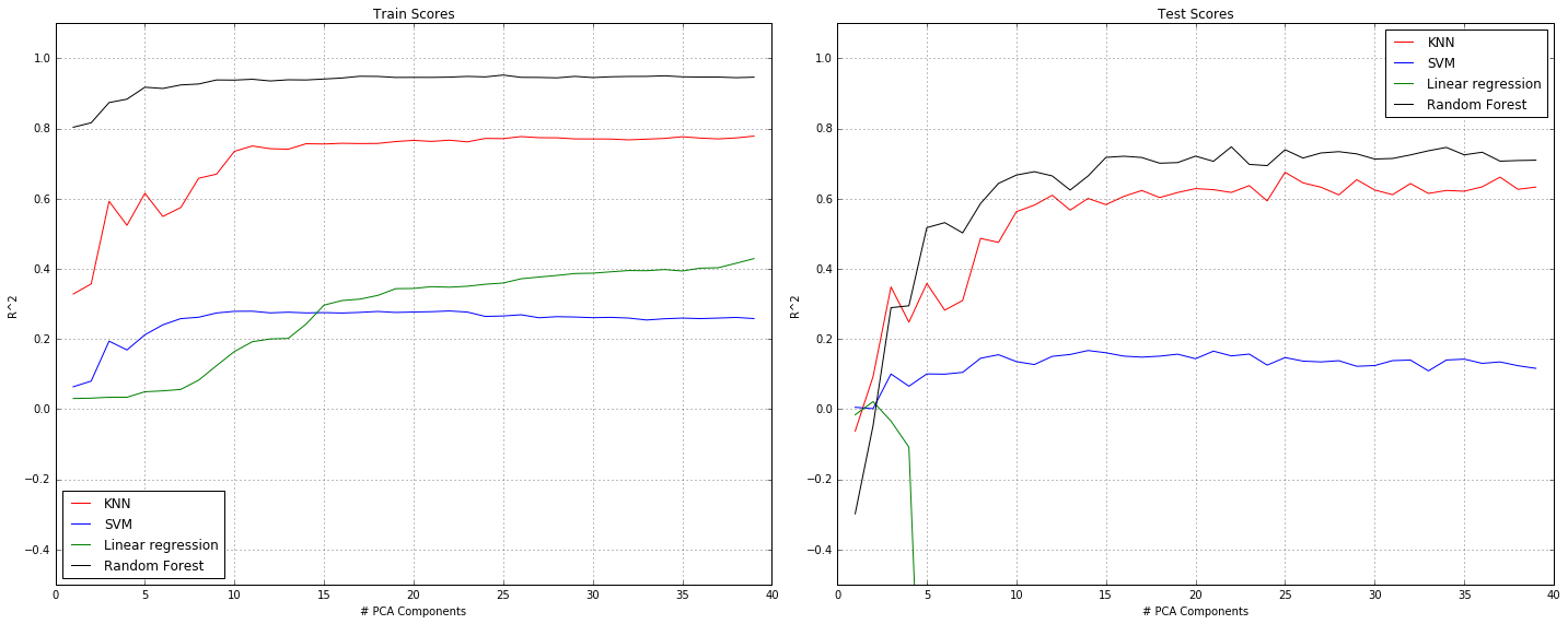
Although in general it seems that increasing the number of PCA components also increases the R^2 score of the models, the model's graphs seem to suggest that 15 PCA components is the minimum number that will not result in a significant decrease in R^2 score. Therefore, we decided to use PCA with 15 components.
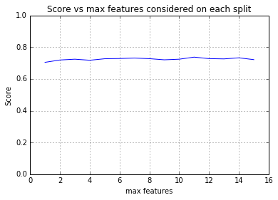
Random-Forest Tuning
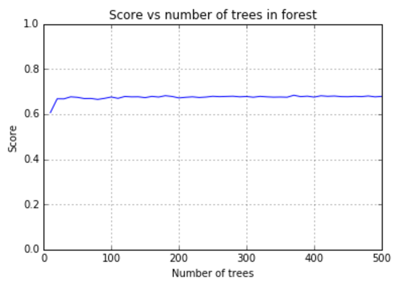
As seen in the graphs above, random forests results in the highest R^2 values on the test set. Therefore, we continued to tune the parameters for the random forests regressor to choose the n_estimators and max_features parameters that result in the highest R^2 values on the test set. We ran 5 fold cross validation for every n_estimators value between 10 and 500 (with increments of 10). Similarly, we tested values between 2 and 15 (the chosen number of PCA components) for the max_features parameter. We found that for n_estimators=100 and max_features=4 we get the highest R^2 value on the test set (75.9%).
It is important to note that the R^2 score of the chosen model only reflects the accuracy of the model on years for which we were able to find census data. As mentioned before, this only includes round decades from 1910 to 2010 (1910, 1920, 1930 etc). Therefore, a high R^2 value doesn't necessarily means that the model actually results in an accurate interpolation of foreign born percentages for years without census data. For that reason, we also created separate graphs for a small number of selected states that show all the predictions for all the years, including the years without census data. On the same graph, we also added the census data used to train the model (shown in red):
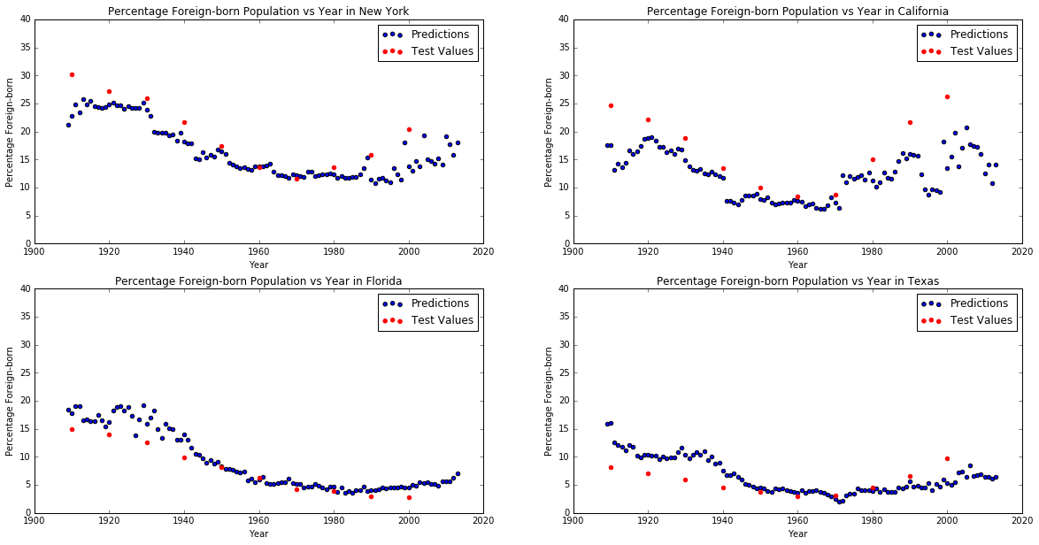
We can see that in some cases the predicted foreign born percentages seem to be inaccurate and don't follow the clearly visible polynomial trend that is apparent in the census data. For that reason, we decided to also try to apply Lasso regression to the PCA components since we thought it might result in a smoother curve that fits the train census data better.
Lasso Tuning
Because Lasso is also used as a dimension reduction method, the number of PCA components found above is not necessarily the best in this case. We therefore tuned the alpha parameters for Lasso using different numbers of PCA components. The results are summarized in the following table:
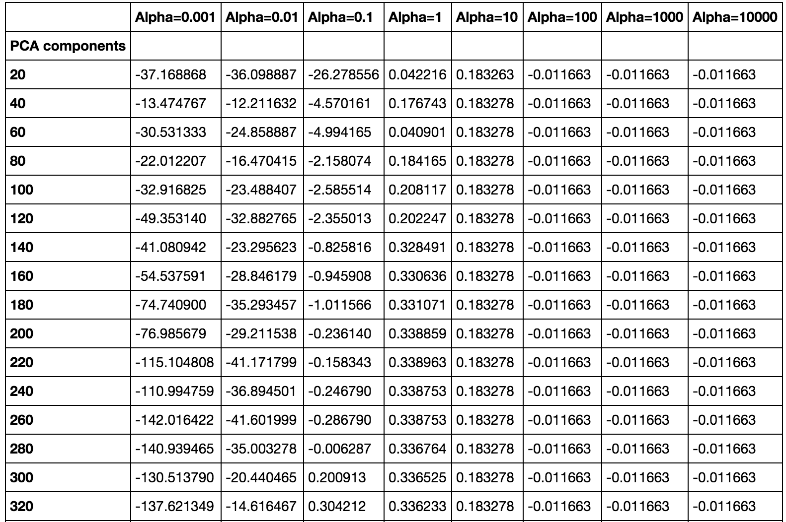
Based on these results, we decided to perform PCA reduction to 140 components before applying Lasso with alpha parameter of 1.
Lasso vs. Random Forests
The following graph shows the predictions for New York and California using Lasso and Random Forests:
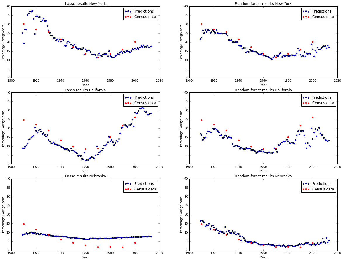
While it varied from state to state, overall Random Forests provided a better fit than Lasso Regression. In many cases it appeared that Lasso was a simpler model; generally the points were more continuous. Random Forests often had more year-over-year variance in our predictions. Often, Lasso was more consistent when predicting years beyond 2000, after the census (training) data stopped. Overall, Random Forests fit the data and trends through the 20th century more closely. For these reasons, we chose to train Random Forests on PCA components for our final model.
Results
Our calculated predictions can be classified along two principle dimensions: geographic and temporal. This necessitates a multimedia approach to representing the data. In order to better visualize the results, a multi-panel animation was constructed. Annual nationwide heatmaps of our predictions were generated, allowing geographic comparison. Each of these heatmaps has been layered into a combined timeline, which best illustrates the time-varying aspect of the data. This timeline is interactive, and a specific interpolation date can be set by dragging the slider across the timeline. A light-to-dark orange gradient was chosen, with extremes set at 0 and 30%. This gradient colors each state according to the share of foreigners in the registered population for each year. This figure was instrumental in quantitatively comparing our predictions and test sets. The multi-state analysis afforded more granularity than looking at each state one-by-one; in this way, we gained insight into the regional trends and variations and immigration.
The line plots are crucial for tying the nationwide slices of time to the state-specific trends. Hovering over each state highlights its border and indicates that year's percentage prediction; clicking said state refreshes the second panel with that state's series-wide predictions. The interpolated, intercensal predictions are represented as a continuous orange line; the true, test values from the Census data are overlaid as black dots. This bi-panel structure is an elegant way to combine infra- and inter-state analysis, allowing simultaneous assessment of each via graph- and heatmap-based visualizations (respectively).
Some generalizations can be extracted from the long-term, interstate view afforded by the map. Overall, in terms of gross historical migration, the heatmaps indicate a decrease in immigrants from 1910–1970, with a reversal in 1970 to a slight increase, and a final explosion in immigration rates post-1990.
To further validate these observations, we relied on historical precedent to help qualitatively frame the data. The directionalities of these immigration trends roughly coincide with three important historical events in the history of U.S. immigration policy: the Immigration Acts of 1924, 1965, and 1990. The 1910 nationwide snapshot helps establish some context with which to judge subsequent changes in immigration. This pattern is typical of early immigration patterns in the US: incredibly high influxes of immigrants (heights not to be seen again until the post-2000's), but concentrated only in the large urban centers of the Northeast and Midwest. (The foreign-born population across the northern states and the Pacific states is indicative of the nascent condition of these states, many of which were only one or two decades old.) In 1924, the government instituted the Johnson-Reed Act which severely limited the allowed number of immigrants based on specific national origins. It prohibited Asians, and restricted immigration levels to 2% of each nationality's total US population in 1890. This act, in combination with the effect in subsequent decades of the Depression followed by World War II, served to harshly curtail immigration levels. Nearly everywhere, the foreign-born population share plummeted (with the exception of in states like Alabama which were historically very homogenous and isolated).
The US remains relatively immigrant-sparse from the aforementioned effects until around 1965, when the Hart-Celler Act effectively reverses the quota laws in place since the 20s. While the bill set a total restriction on the number of allowable visas per year at 170,000, created special categories for preferential candidates to be fast-tracked through the process, and relaxed many of the prohibitions and nationality-based limits. This partial loosening of the immigration laws is evident in the data. While there is a modest revival of immigration rates immediately post-1965, it is concentrated only in areas with high amounts of Hispanic immigration: California, Arizona, New Mexico, Texas, Florida, Illinois, New York. The first four (CA, AZ, NM, TX) are border states; the latter three (FL, IL, NY) have metropolitan centers with large Hispanic populations and consequent ethnic influence (Miami, Chicago, and New York, respectively). The high and consistent levels of Hispanic immigration buoy these states, and we see rebounds in their immigration levels while other regions of the US stay quite homogeneous throughout the 1960s to 1980s.
The final inflexion point comes around 1990, when the government issues the Immigration Act of 1990. The act stipulates that the total allowable number of visas would be increased nearly seven-fold, to 700,000 per year. It would remain at that level for three years, after which it would stabilize to 675,000 per year. The English testing requirement for naturalization was also removed, making it even easier for immigrants to enter the process. This multi-pronged method produced strong results: in the years following the act, especially at the turn of the new millennium (2000), immigration rates skyrocket nationwide. The last two decades of data paint a very different picture than the first two. While high levels of immigration have returned to the US, no longer are they concentrated in the growing Pacific Coast, or the urban centers in New England and the Midwest. For the first time, the entire country is bathed in an orange tint. This is concordant with the way society works today, and the technologies that make immigration possible. Whereas immigration in its earliest days was limited to steamship travel to a select few port cities (i.e. the Northeast and Chicago/Midwest), travel is now much more distributed: it is as easy to put down roots in Kansas as it is in New Jersey.
Overall, the visualization does an excellent job demonstrating the confluence between the economic, the military, the social, the political, and all of their roles in affecting demographic data. While our predictions fit the general trends well, there are some specific corner cases where the model fails to effectively capture the data. These issues result from some of the inherent limitations in our model. The predictions are made by consciously ignoring the state in which a baby was born; thus, the state-by-state details are backed out from a nationwide model that only takes into account the annual distribution of baby names.
In order to provide the most diverse representation of our results, a small subset of states was selected for in-depth evaluation: New York, Georgia, New Mexico, Alaska, and Hawaii. These specific examples illustrate the successes and shortcomings of our model.
New York (NY)
New York is an example of state with a moderately good prediction fit over its test values (please refer to Our Predictions for the detailed infra-state line plot). The model captures the early test values well, but fails to pick up on the post-1990s immigration boom. New York fits the archetypal model of an "early-adopter" state. These states are generalized by a U-shaped immigration curve. High rates of foreigners in the early 1900s accompanied by a later revival in the postwar boom. Some other states fitting this shape include Illinois, Ohio, Michigan, and Pennsylvania.
Georgia (GA)
Georgia demonstrates a strong fit of the predictions against Census test observations. Additionally, the state is a strong candidate for another regional archetype: the "white South." States all across the Southern region exhibit this pattern: Virginia, Kentucky, Tennessee, North Carolina, South Carolina, Georgia, Mississippi, Alabama, Louisiana, and Arkansas (and to a smaller extent Missouri). The trend is characterized by incredibly low (to zero) rates of immigration throughout the first two thirds of the time series. These states remained very homogeneous during he first era of immigration history with barely perceptible changes after 1965, and only began notable diversification after the post-90s boom in nationwide foreign-born populations. Georgia is a prime example of the white Southern state whose population is relatively isolated and stable, with a recent opening up only occurring in the contemporary period (right around Atlanta's 1996 hosting of the Summer Olympics).
New Mexico (NM)
New Mexico is one of the corner cases where our model really struggles. Its foreign-born shares should be roughly similar to its surrounding neighbors (particularly California, Arizona, and Texas). Indeed, the Census test values follow one another closely, and suggest yet another "Southwest" cluster sharing the common effects of recent, high Hispanic immigration to these border states. However, the model suffers from oversensitivity, with sharp peaks and troughs on the plot across the whole time series. Furthermore, the model consistently over-predicts the test values, altogether adding up to an unreliable set of predictions of this state. These "vertical shifts" of the predictions away from the test values appeared in a handful of other states. Other states suffering from this predictive volatility and vertical shifting, but to a lesser extent, include Missouri, Kansas, and Florida.
Alaska (AK) and Hawaii (HI)
Alaska and Hawaii are unique cases for our model. We only had Census data starting at 1960 for these two states. This was unavoidable as foreign-born statistics were historically only recorded for states, and AK and HI were not admitted to the Union until 1959. With nearly half the test observations to compare against missing, these large gaps meant it was difficult to assess the performance of these two states. HI exhibits a similar "vertical shifting," like NM, in its predictions. Nevertheless, given so few observations to validate our predictions, no clear conclusions can be made regarding why HI in particular deviates so strongly from the actual foreign-born data.Conclusion
In conclusion, our model has strong predictive power for at least most states, and succeeds in our stated goal of fitting a generalized national model to each state to extract out specific immigrant population estimations. While our model fails to accurately predict a handful of states, it nonetheless performs acceptably, and generates a number of interesting impressions demanding some reflection.
A primary area of interest for further exploration involves greater ethnic detail on immigration. We hope to expand our predictor’s complexity by slicing foreign-born groups into specific regions and predicting these regional distributions. Incorporation of more detailed Census data would be helpful in this regard, doubling the number of test observations to score our prediction against. By using racial demographic data for each state, we may be able to cross-reference baby name distributions with racial breakdowns. This would enhance the granularity of our predictions: instead of just estimating the number of foreigners, we would be able to estimate the number of proportion of foreigners who belong to specific nationalities.
A secondary thread to pursue revolves around the regional characteristics identified in the above-mentioned Results section. These "state archetypes" (early adopters, white South, border states, Northwest settlers, etc.) seem to be strongly linked to the geographical interstate regions. A fruitful field of further study would involved a clustering analysis of the state predictions, to see if any of them behave in specific ways that can be reasonably grouped together into a few categories. These categories could be cross-referenced to the qualitative categories extracted from the results analysis, thereby validate/nullifying the initial theories.
References
- Datasets
- Baby names: Kaggle
- Foreigner demographic data: U.S. Census Bureau
- Works Referenced
- Barucca, Paolo, et al. "Cross-correlations of American baby names." Proceedings of the National Academy of Sciences 112.26 (2015): 7943-7947.
- Ewing, Walter A. "Opportunity and Exclusion: A Brief History of U.S. Immigration Policy." Immigration Policy Center, American Immigration Council (January 2012): 1–7.
- Twenge, Jean M., Emodish M. Abebe, and W. Keith Campbell. "Fitting In or Standing Out: Trends in American parents' choices for children’s names, 1880–2007." Social Psychological and Personality Science 1.1 (2010): 19-25.